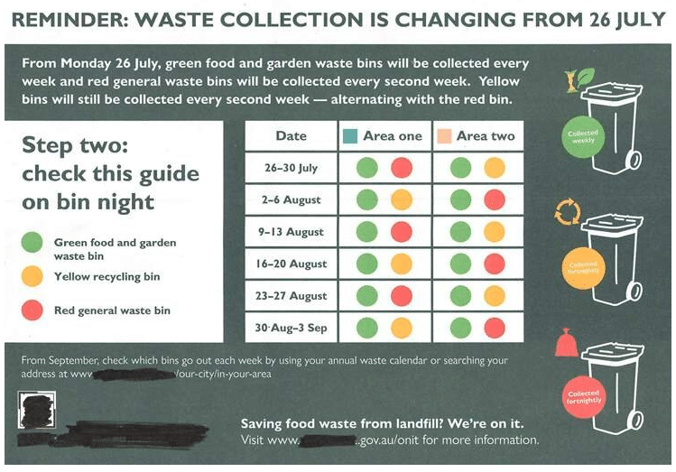
Last week, my neighbour and I puzzled over this flyer from the council – about waste collection, always a touchy topic. As you can see from the picture, they’re changing the frequency of waste collection.
A visual guide instructed us which bins to put out each week. But only until September, when we will have to search online or look at our annual waste calendar (our what?) to confirm our schedule.
Maybe it’s that we’re both COVID weary, but we expended a few brain cells trying to get our heads around the schedule.

Which bin when? What do they mean by a red bin? We’ve only got green bins and yellow bins. Haven’t they both been collected every week for the past month? #SoConfused.
Then we noticed the logo in the bottom corner. Finally, it all made sense. A neighbouring council delivered this card to our street by mistake. Our bin collection stays weekly (for now). Phew!
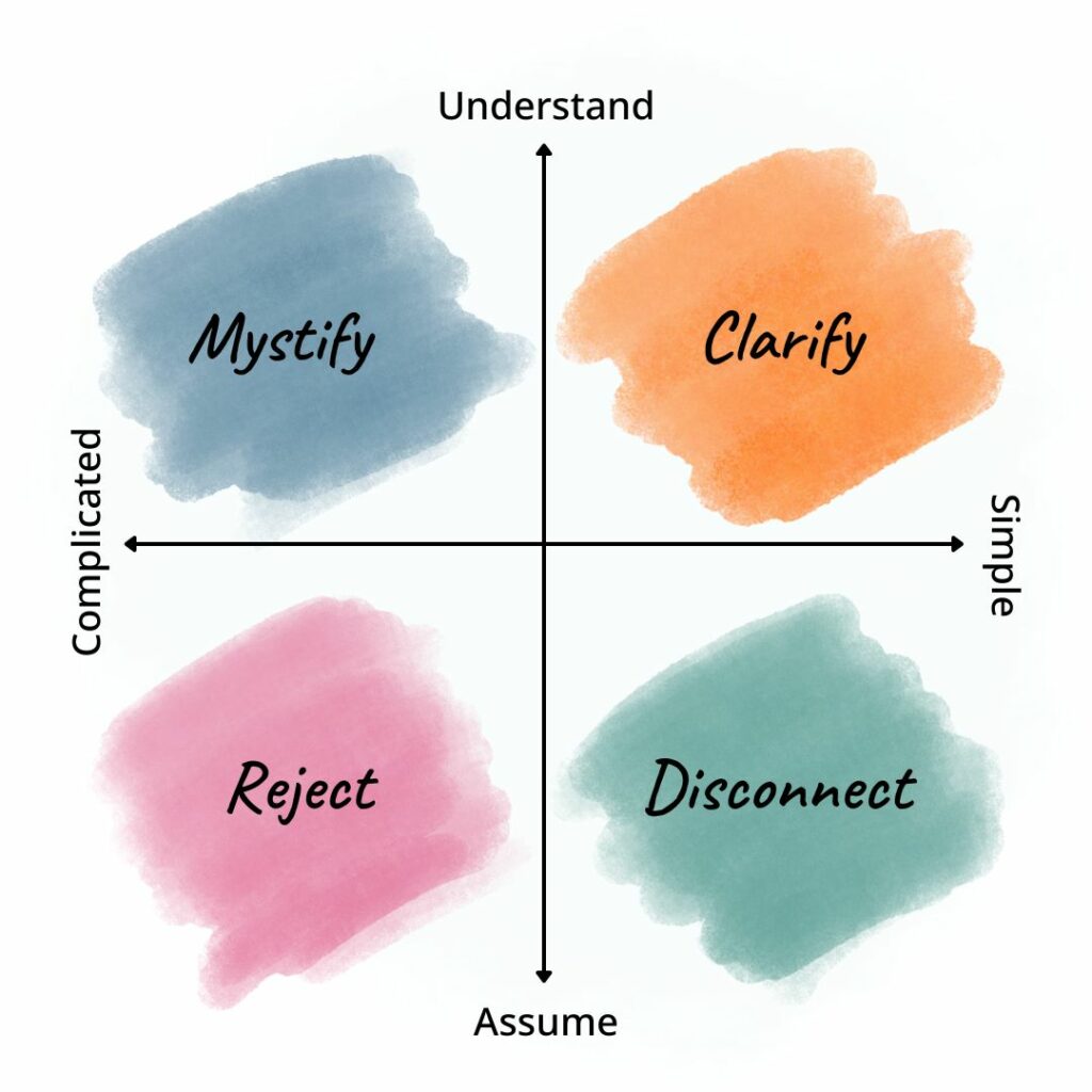
We are so focused on what we want to say we forget to think about how our communication lands.

We assume that our meaning is clear and over-complicate our message, which leads many audiences to reject the message entirely.
When we focus on understanding our audience, but our communication stays complicated, we mystify rather than clarify.
A lot of work had gone into this particular flyer – graphics, mapping, tables, colour coding and so on. But for me, the total package did not compute.
I’m sure you get a second pair of eyes across most of your communication pieces, but is your reviewer too close to the subject matter? User testing is a pretty standard part of building websites these days. Perhaps we could employ it more often with our comms?
